Graph-Explorer: A graphite dashboard unlike any other
In web operations, mostly when troubleshooting but also for capacity planning,
I often find myself having very specific information needs from my time-series, and these information needs vary a lot over time.
This usually means I need to correlate or compare things that no one anticipated. Things that relate to specific machines, specific services across machines,
or a few specific metrics of which only the ops team knows how they are related and cross various scopes (application, network, system, etc).
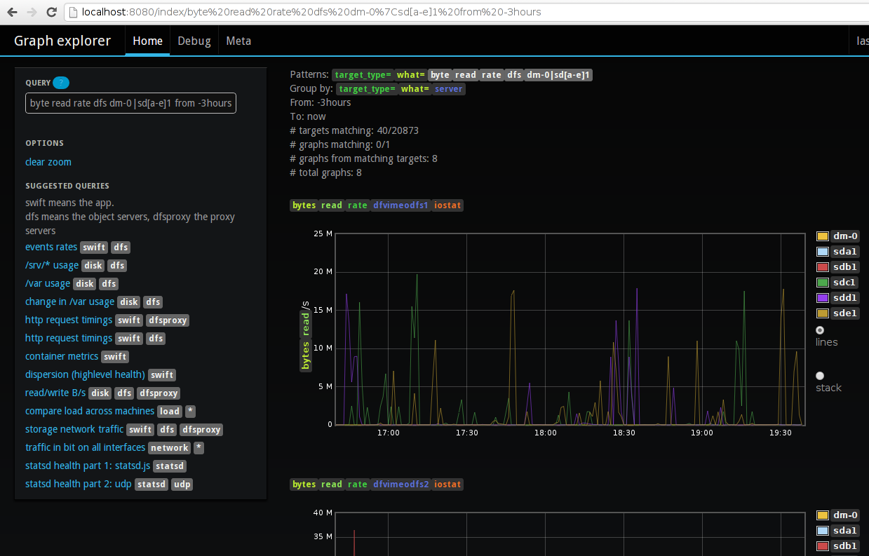
I should have an easy way to filter metrics by any information in the metric's name or values.
I should be able to group metrics into graphs the way I want. (example: when viewing filesystem usage of servers,
I should be able to group by server (one graph per server listing the filesystems, but also by mountpoint to compare servers on one graph).
I should be able -with minimal effort- to view metrics by their gauge/count value,
but also by their rate of change and where appropriate, as a percentage of a maximum (like diskspace used).
It should be trivial to manipulate the graph interactively (toggling things on/off, switching between lines/stacked mode, inspecting datapoints, zooming, ...).
It should show me all events, colorcoded by type, with text description, and interactive so that it can use hyperlinks.
And most of all, the code should be as simple as possible and it should be easy to get running.
Dashboards which show specific predefined KPI's (this covers most graphite dashboards) are clearly unsuitable for this use case. Template-based "metric exploration" dashboards like cacti and ganglia are in my experience way too limited. Graph composing dashboards (like the stock graphite one, or graphiti) require much manual work to get the graph you want. I couldn't find anything even close to what I wanted, so I started Graph-Explorer.
The approach I'm taking is using plugins which add metadata to metrics (tags for server, service, mountpoint, interface name, ...), having them define how to render as a count, as a rate, as a percent of some max allowed value (or a metric containing the max), and providing a query language which allow you to match/filter metrics, group them into graphs by tag, and render them how you want them. The plugins promote standardized metric naming and reuse across organisations, not in the least because most correspond to plugins for the Diamond monitoring agent.
Furthermore, because it uses my graphitejs plugin (which now btw supports flot as a backend for fast canvas-based graphs and annotated events from anthracite) the manual interactions mentioned earlier are supported or at least on the roadmap.
Graph Explorer is not yet where I want it, but it's already a very useful tool at Vimeo.Add comment

@name