Histograms in statsd, and graphing them over time with graphite.
I submitted a pull request to statsd which adds histogram support.
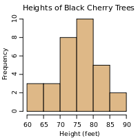
(refresher: a histogram is [a visualization of] a frequency distribution of data,
paraphrasing your data by keeping frequencies for entire classes (ranges of data).
histograms - Wikipedia)
It's commonly documented how to plot single histograms, that is a 2D diagram consisting of rectangles whose
- area is proportional to the frequency of a variable
- whose width is equal to the class interval
Note: histogram class intervals are supposed to have the same width.
My implementation allows arbitrary class intervals with potentially different widths, as well as an upper boundary of infinite.
Plotting histograms.. over time
We want to plot histograms over time, and not just for a few select points in time (in which case you can just make several histograms),
but a contiguous range of time, preferably through graphite's 2D graphs cause graphite is neat and common enough.
Time goes on x-axis, that's pretty much a given. So I'm trying to explore ways to visualize both class intervals as well as frequencies on the y-axis.
The example I'll use are page rendering timings, condensed into classes with upper boundaries of 0.01, 0.05, 0.1, 0.5, 1, 5, 10, 50 and infinite seconds
Tips and notes:
-
the histogram implementation stores absolute frequencies, but it's easy to get relative frequencies in percent, like so:
target=scale(divideSeries(stats.timers.<your_metric>.bin_*,stats.timers.render_time.count),100) - I'll be using relative frequencies here because it normalizes the scale of the y-axis
- In this use case each class has a notion of desirability (low render time good, high render time bad),
I think it makes sense to use color to represent this. This extends to a lot of operational metrics which one would be using histograms for.
(unlike non-software histograms that represent demographics or tree heights, where classes usually have nothing to do with desirability or quality).
As it turns out, it's fairly easy to programmatically compute colors between green and red in order to have mathematically correct "steps" of color.
However, Looks like HSV values are more suited than RGB but graphite doesn't support HSV (yet) (although one could convert HSV to RGB). Also it looks like green-purple would be a better choice for people with color blindness. I haven't gone too far in this topic. - Since I choose to go with color gradients, it means I better use stacked graphs, otherwise it would be too hard to distinguish which graph is what
- None of this is restricted to timing data. The metric type under which histograms are (and should be) implemented is called "timing", which is a misleading name but we're working on renaming it.
First version
http://localhost:9000/render/?height=300&
width=740&from=-24h&title=Render time histogram&
vtitle=relative frequency in %&yMax=100&
target=alias(color(scale(divideSeries(stats.timers.render_time.bin_0_01,stats.timers.render_time.count),100),'2FFF00'),'0.01')&
target=alias(color(scale(divideSeries(stats.timers.render_time.bin_0_05,stats.timers.render_time.count),100),'64DD0E'),'0.05')&
target=alias(color(scale(divideSeries(stats.timers.render_time.bin_0_1,stats.timers.render_time.count),100),'9CDD0E'),'0.1')&
target=alias(color(scale(divideSeries(stats.timers.render_time.bin_0_5,stats.timers.render_time.count),100),'DDCC0E'),'0.5')&
target=alias(color(scale(divideSeries(stats.timers.render_time.bin_1,stats.timers.render_time.count),100),'DDB70E'),'1')&
target=alias(color(scale(divideSeries(stats.timers.render_time.bin_5,stats.timers.render_time.count),100),'FF6200'),'5')&
target=alias(color(scale(divideSeries(stats.timers.render_time.bin_10,stats.timers.render_time.count),100),'FF3C00'),'10')&
target=alias(color(scale(divideSeries(stats.timers.render_time.bin_50,stats.timers.render_time.count),100),'FF1E00'),'50')&
target=alias(color(scale(divideSeries(stats.timers.render_time.bin_inf,stats.timers.render_time.count),100),'FF0000'),'inf')&
lineMode=slope&areaMode=stacked&drawNullAsZero=false&hideLegend=false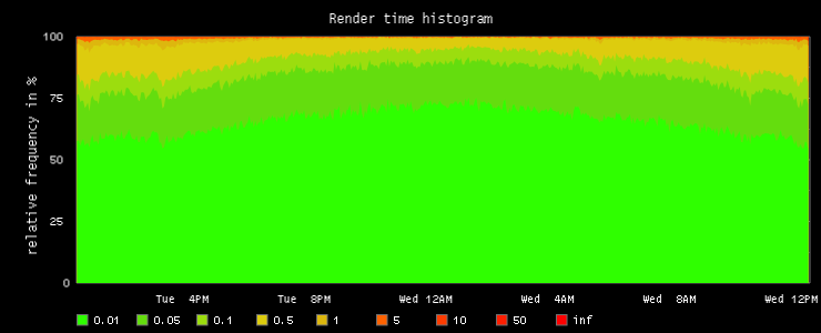
Turns out we mainly see the vast majority that performs well, simply because with this way of rendering, the higher the frequency of a class, the more prominent. Bad values are hard to see because there's not many of them, despite being more interesting. A thought I had at this point was to make all "class bands" equally wide and use a green-to-red gradient to denote the frequency values, or even just keep the current color assignments but rely on something like opacity to express frequencies. Alas, none of this is currently possible with graphite, as far as I can tell. Though I would like to explore this further. Especially because I think it wouldn't be hard to implement in graphite.
So, let's see what can be done right now.
Leaving out the smallest class
This adaption is basically the same as before, but leaves out the smallest class (which took most space), this way the other bands are a bit more visible but the effect isn't as clear as we want.http://localhost:9000/render/?height=300&
width=740&from=-24h&title=Render time histogram&
vtitle=relative frequency in %, leaving out first class&
target=alias(color(scale(divideSeries(stats.timers.render_time.bin_0_05,stats.timers.render_time.count),100),'64DD0E'),'0.05')&
target=alias(color(scale(divideSeries(stats.timers.render_time.bin_0_1,stats.timers.render_time.count),100),'9CDD0E'),'0.1')&
target=alias(color(scale(divideSeries(stats.timers.render_time.bin_0_5,stats.timers.render_time.count),100),'DDCC0E'),'0.5')&
target=alias(color(scale(divideSeries(stats.timers.render_time.bin_1,stats.timers.render_time.count),100),'DDB70E'),'1')&
target=alias(color(scale(divideSeries(stats.timers.render_time.bin_5,stats.timers.render_time.count),100),'FF6200'),'5')&
target=alias(color(scale(divideSeries(stats.timers.render_time.bin_10,stats.timers.render_time.count),100),'FF3C00'),'10')&
target=alias(color(scale(divideSeries(stats.timers.render_time.bin_50,stats.timers.render_time.count),100),'FF1E00'),'50')&
target=alias(color(scale(divideSeries(stats.timers.render_time.bin_inf,stats.timers.render_time.count),100),'FF0000'),'inf')&
lineMode=slope&areaMode=stacked&drawNullAsZero=false&hideLegend=false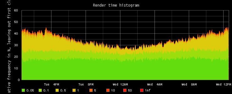
Per-band scaling
Finally, the bigger the values represented by each class the more we inflate the band, so the more problematic cases become more visible, despite having a lower frequency.http://localhost:9000/render/?height=300&
width=740&from=-24h&title=Render time histogram&
vtitle=rel. freq with scale adjustment per band&
target=alias(color(scale(divideSeries(stats.timers.render_time.bin_0_01,stats.timers.render_time.count),0.01),'2FFF00'),'0.01')&
target=alias(color(scale(divideSeries(stats.timers.render_time.bin_0_05,stats.timers.render_time.count),0.04),'64DD0E'),'0.05')&
target=alias(color(scale(divideSeries(stats.timers.render_time.bin_0_1,stats.timers.render_time.count),0.05),'9CDD0E'),'0.1')&
target=alias(color(scale(divideSeries(stats.timers.render_time.bin_0_5,stats.timers.render_time.count),0.4),'DDCC0E'),'0.5')&
target=alias(color(scale(divideSeries(stats.timers.render_time.bin_1,stats.timers.render_time.count),0.5),'DDB70E'),'1')&
target=alias(color(scale(divideSeries(stats.timers.render_time.bin_5,stats.timers.render_time.count),4),'FF6200'),'5')&
target=alias(color(scale(divideSeries(stats.timers.render_time.bin_10,stats.timers.render_time.count),5),'FF3C00'),'10')&
target=alias(color(scale(divideSeries(stats.timers.render_time.bin_50,stats.timers.render_time.count),40),'FF1E00'),'50')&
target=alias(color(scale(divideSeries(stats.timers.render_time.bin_inf,stats.timers.render_time.count),60),'FF0000'),'inf')&
lineMode=slope&areaMode=stacked&drawNullAsZero=false&hideLegend=false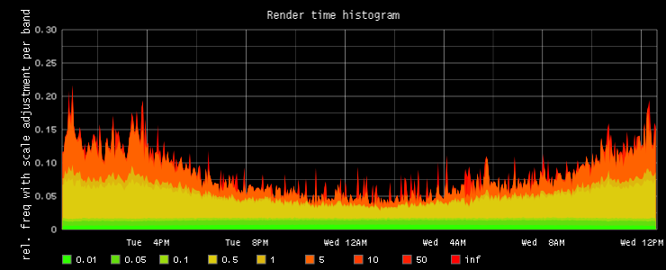
I started off by scaling each band by the width of the class interval. This is actually more arbitrary than it may seem.
The point is that now it's easier to spot acute as well as long-standing problems, but note you can't really read statistics from this graph because of the per-band scaling.
Note also that outliers contribute to the outer band(s) and are given as much focus as non-outliers in the same bands. In a system over which you have no complete control (i.e. if you were graphing histograms of time until first byte or page loaded at client, where you rely on the internet as a transport) it makes sense to give less attention to outliers and focus on optimizing for as many users as possible, I think it there's no reliable way to subtract outliers from the upper bands and you should also graph averages and percentiles and understand what each graph does. But anyway here I want to include outliers, because they represent latencies we can fix.
Final notes
While the tools we have are by no means perfect, I'm seeing gradual improvement in the monitoring space. This work is only a small piece of the puzzle. The rendering of histograms can be improved but at this point I think they are good enough to be usable. The real challenge is putting in place automated trending, anomaly detection and alerting. If we can figure that out, there's less need to be looking at graphs in the first place.Add comment

@name